How to choose the right brand color.
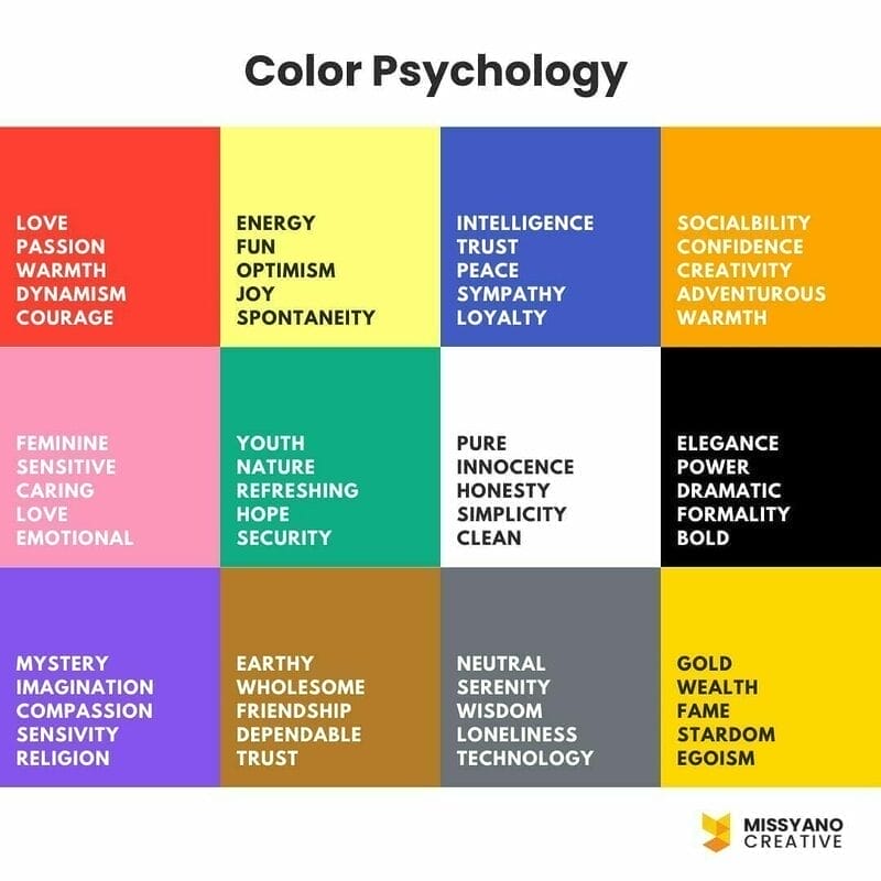
Color Psychology
Every color has its meaning and effects on the audience emotionally. According to neuroscientist Antonio Damasio, consumers’ feelings towards a brand have more influence than their thoughts about it.
When you combine that with the fact that particular colors elicit specific emotions, your brand colors have the power to influence your sales or performance even more than the things you sell.
Choosing the right color for your brand is a critical component in establishing trust, making customers feel at ease, and cultivating long-term brand advocates.

60-30-10 Rule
The 60-30-10 guideline can help you in harmonising your colour scheme and creating a well-balanced interface design.
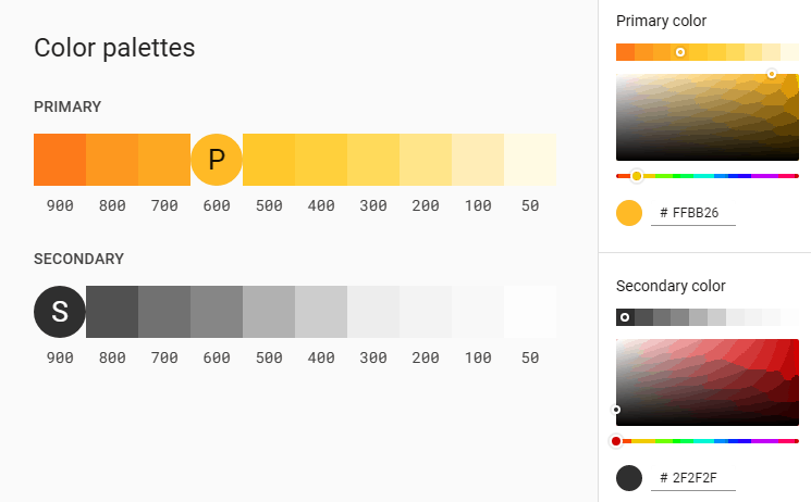
The concept is simple: when selecting a new colour palette, the dominant colour (usually called neutral) should account for 60% of the palette, the secondary colour (which is considered complementary) accounts for 30% of the palette, and a third colour (accent) accounts for the remaining 10% of the design.
To simplify the 60-30-10 rule above:
60%: primary color
30%: secondary / complementary color (opposite of your brand color)
10%: third color for your accent (e.g. link hover color)
The primary colour
A primary colour is the one that appears the most often on your app’s displays and components.
The secondary colour
A secondary colour gives you extra options for accenting and distinguishing your goods. A secondary colour is optional and must be used sparingly to highlight specific elements of your UI.
If you don’t have a secondary colour, you can reuse your primary colour to emphasise items.
Secondary colours are ideal for the following applications:
- Action buttons that float
- Selection controls: e.g. sliders, switches
- Progress bars for highlighting chosen text
- Headlines and links

Use Monochromatic Color Scheme
Monochromatic color schemes start with a single base color and grow by adding shades, tones, and tints of that color. When you add white, you get a tint. When you add a darker color, like grey or black, you get a shade or tone.
Remember to check color contrast
Check color contrast for your text and background. The last thing you want is like having a light yellow on a white background. See how difficult it is to read that? Color contrast checker helps you make sure you don’t choose colors that will make people’s eyes hurt when they try to read the words.
Color Tools
- Material.io
- Color theme creation guide
- Coolors – Get inspiration and save your colors
- Material UI colors
- Paletton – The Color Scheme Designer
- Material Design Palette Generator
- Adobe Color
- ColorSpace – Color Palettes Generator and Color Gradient Tool
- Dribbble – Discover the World’s Top Designers & Creative Professionals
- Free Gradients Collection by itmeo.com
- Color Palettes for Designers and Artists – Color Hunt
- Color Palette Generator – Create Beautiful Color Schemes


